
The official date of the mobilegeddon has arrived and left, but its impact to search engine can still be felt. In this modern world of internet where sites with large visbility, zoom free readability, buttons, pictures that do not load fast and optimized screen resolution will be standing in the table stakes. But like the hit song from the movie, which marketers have named this project after, insists marketers to not want to miss a thing when it comes to mobile. Beyond the site and the adjustment sin the landing page, marketers should also be mindful of how to format and align their content for the most mobile visibility and utilization. Here are a few useful tips the Zoom Web Media suggests might help cope this mobilegeddon.
Clear and Concise Headlines
Compelling headlines are always on the top of mind for content marketer, but these compelling headlines are more critical in the mobile format. Limited real estate or space is mobile means that a title should use word that counts. Execute a good litmus test and ask yourself how will the headline look on Twitter? If the name gets a click from you then it is a good sign for a name.

image credit: http://www.themcmethod.com/
The Duke of URL
Google announced it plans on how the links and URLs would appear on a mobile display. More intuitive breadcrumb structure along with real website names that line up with the Schema structure is going to show after the update. Therefore, Zoom Web Media proposes that structuring the site data with the rich Schema tags will help in improving relevancy, providing clear navigation to users and generate more engagement.
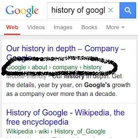
image credit:http://www8.pcmag.com/
The Inverted Pyramid
Take this tip from journalists and do not bury your lead. Don’t make your viewers do a lot of scrolling work before they get the main point. Highlight the key points at the very beginning and save the extra details for later in page content or may be skip them altogether. Ensure that you cover the basic five W’s and ensure that the content should matter to the audience.
Short Paragraphs Are Ideal
Large chunks of text can be a daunting task on a small screen and it may discourage someone from reading the entire content all the way through. Keep all your paragraphs limited to only a few sentences to help break the content into small paragraphs. Use lists and bullets to catch the reader’s eye and take the content from there where you want it to go.
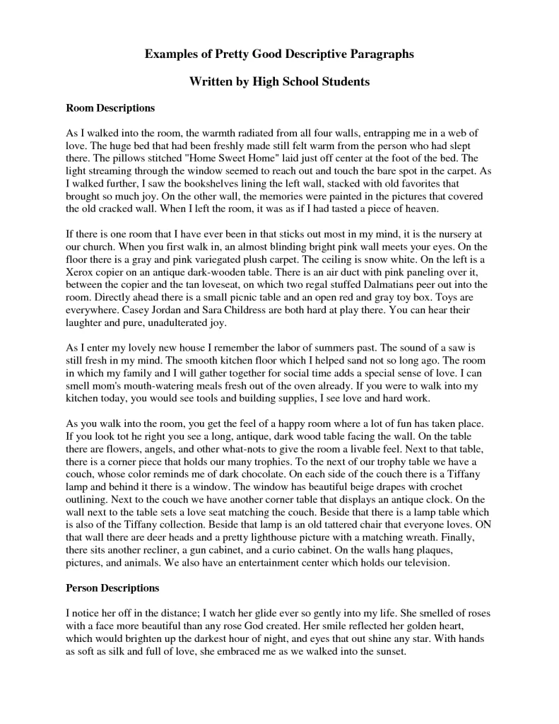
image credit:http://img.docstoccdn.com/
Call Of Action- Feature It Prominently
Zoom Web Media states that in addition to making buttons that are more clickable, write the call of action early in a post rather than the end. Ensure that the desired conversion can be made easily by mobile audience. For mobiles, think “micro moments”.

image credit:http://blog.leadsquared.com/
Optimizing the Content
Write content that are mobile conscious. Monitor this written content and optimize the content to create a high force outcome. A few parts that you need to pay attention here are:
- Create and maintain Meta Descriptions that stand out from others
- Incorporate important keywords in the content to make the writing more appropriate.
- Format the headings of your post in a SEO- friendly manner.
- Select and tag the images for maximum optimization.
The site’s mobile friendliness is one of the several signals that influence the ranking. According to Google, non-mobile friendly websites won’t get lost from the mobile search results- they may still rank high if the content is very good. In short it’s all about content and content.
Creating content in the era of mobile first should be a balance of staying on the top of trends while also staying true to the brand and knowing the customers. Do not just simply chase the updates of Google but work in understanding it in context of the audience and business.