
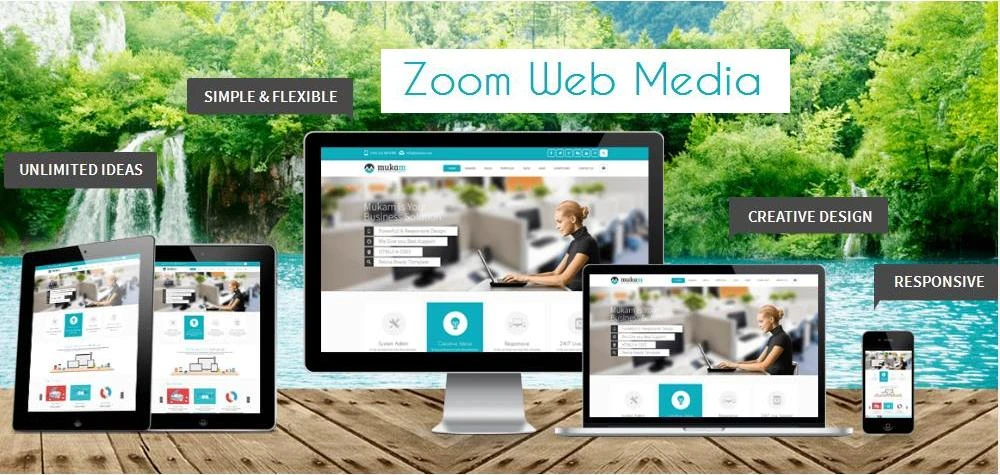
The invention of responsive website designing can well be seen as the very obvious effect of the growing popularity of different devices other than laptops and desktops as the tools for reaching out to internet for searching for different types of information. Responsive structure of a website allows the webpage to get itself fitted in any screen size without blurring its view or pixilation of images. The ultimate goal is to Shape up to Suit all Screen Sizes. In most of the cases, responsive structure of websites has been found to be quite helpful for the SEO process of the site as well. Just have a look at the benefits of responsive web design in the process of SEO.
Local SEO Ranks: Any small business targeting an effective local SEO procedure for itself will surely opt for responsive designing of their website. With a growing population using different devices like, Android phones, Tablets, i-Phones, Tablets, i-Pads and accessing internet through them, Mobile Responsive system is becoming popular among people. As more and more people these days open different sites on mobiles and other devices, it is important for every website has to have a responsive structure. That makes the site visible to many mobile users. This way, the site goes up in the search engine ranks due to an wide exposure to a large number of users. Moreover, Google also finds the site to be worth being sent to the higher rank of search engine. Small businesses simply cannot afford high bounce rate or losing customers by avoiding responsive web design.
Moves Away Duplicate Content: Businesses having different sites for desktop and mobile usually use the same content for both the sites. In cases, a business is making separate sites for both the devices, high chances are there for getting penalized due to duplication of content. The Mobile Responsive process is allowed to use the same content for the two versions of the site.
Lowers Down SEO Investment: In case a business uses a responsive website, the same URL is used in both the formats of it (that opens in desktop and the other one opening in the mobile). Having same URL for both the forms of websites also make it easier for the Google crawler to crawl the content easily. So, all sorts of on-site SEO efforts like, Meta tagging also remains applicable for all formats of the website. On the other hand, link building efforts also become less pricey as it is done for all devices simultaneously.